Bad test-takers, or the wrong study technique?
Two students study 10 hours each. One aces the exam. Why?
A lot of the time, students, myself included, scroll reels, watch YouTube videos, and binge-learn from numerous study sites, hoping something finally clicks for the topics we're dreading. But how would we know what actually works for us?
Most students rely on studying habits that feel productive but aren't backed by evidence, and most study apps either give generic advice or lean on debunked "learning style" quizzes (visual, auditory, kinesthetic) that research doesn't support.
How you study predicts your score better than how long you study
One of the strongest findings in cognitive psychology is that how students study predicts performance better than how long they study. Students who use evidence-based techniques consistently outperform students who rely on passive review, which is exactly why two students can both study 10 hours and earn very different scores. Researchers have repeatedly found that practice testing itself is one of the most effective learning methods, because it strengthens memory retrieval, the exact skill exams require.
Evidence-based, works
Active recall Spaced repetition Practice tests Interleaving topicsPassive habits, doesn't
Re-reading notes Highlighting Cramming Passive reviewWhat 20 students told us 🤔
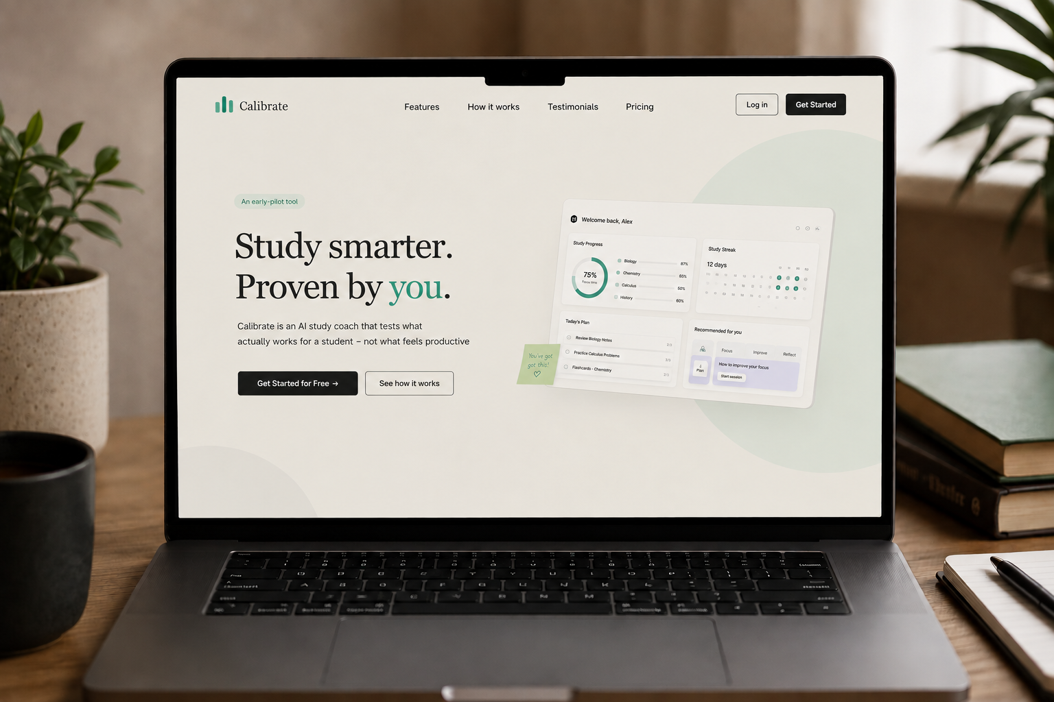
Over the course of 3 weeks, I surveyed and interviewed 20 participants to check whether this gap, not knowing what actually works, was something students genuinely felt, or just a theory. It held up: most students told us they default to whatever worked in the past rather than actually knowing what's effective, which is precisely the uncertainty Calibrate is built to solve.
From "I don't know how to study" to "I know what works for me"
So… what next?
The first flow I made sent the user straight on to the next day's assignment without any feedback. But what if the user didn't like the technique that was applied?
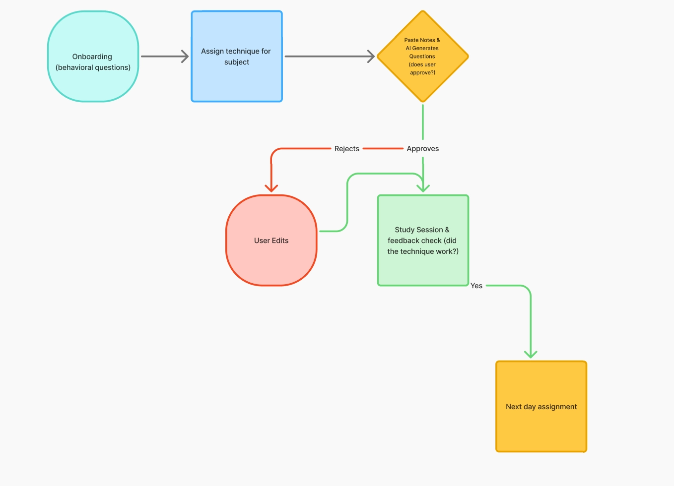
I iterated through 2–3 different flow directions before landing on a final workflow appropriate for our 3-week timeline. Each round closed a gap I'd identified through internal review, for example, that first version had no way to flag that a technique hadn't worked, which I caught and redesigned before it ever reached a user.
That revision fixed the immediate problem, but reviewing it again with the team surfaced two more gaps before we moved to the lo-fi wireframe.
First, onboarding itself was doing too much before a student ever reached anything we'd already validated. I brought a decision to the team: move a quick walkthrough of how to use the product, and a privacy disclaimer, to the very front of the flow, ahead of the existing onboarding questions. My thinking was that onboarding needed to be fast and low-confusion from the first screen, not something students figured out three steps in. The team agreed, and both steps moved to the top of onboarding.
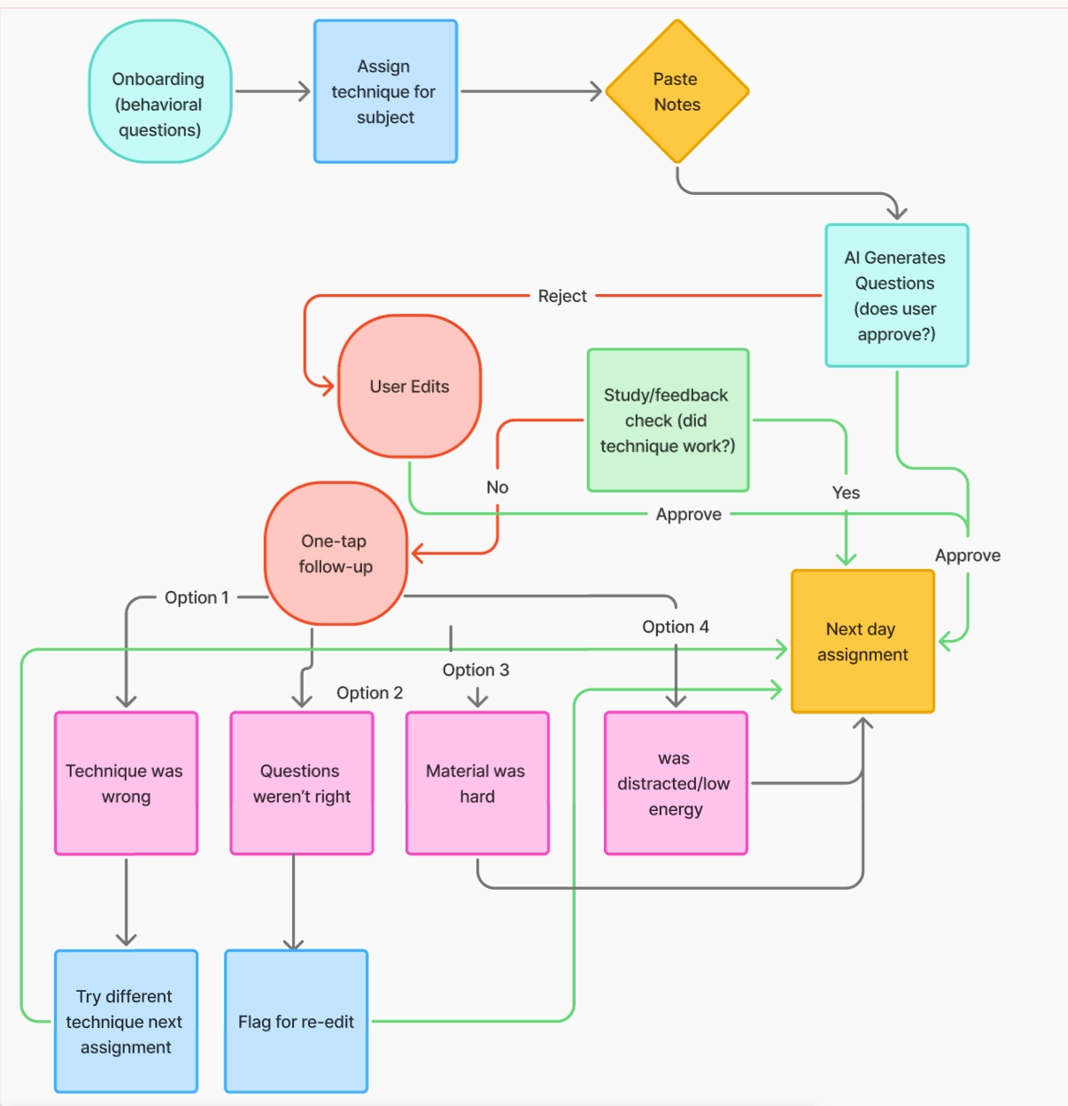
Second, the feedback check itself needed to be smarter. The revised flow asked "did the technique work?" after every study session, but that question conflates two different failures: the technique not working, and the student simply missing a question because they didn't know the material yet. I added a missed-question check inside the active study session. If a student missed something, the flow routes straight to reviewing that material the next day and skips the technique-feedback question entirely, since a missed question there isn't real evidence the technique failed. Only sessions with no missed questions move on to the "did this work?" check. That separation kept our technique-effectiveness data from getting muddied by ordinary content gaps.
The final flow below reflects both of those changes.

Choosing what to build, and what not to 🥳
Pivoting away from History
We initially decided History would be the right first subject, since it leans heavily on remembering causes, dates, and connections, a strong test case for evidence-based recall techniques. But once we ran our user survey, almost every participant told us they actually wanted help with STEM courses instead: Math, Chemistry, even flight school test prep! (maybe flight school is where version 2 of Calibrate goes 👀). This pushed us to pivot off History and rethink our subject roadmap.
Descoping test-anxiety coaching
I originally wanted to build a test-anxiety coach into the product, which is part of why we included the post-exam feedback check-in. But test anxiety is a mental health domain, not a study-technique domain, a much heavier design problem than it sounds. "Supportive coaching" for anxiety means the AI is making judgment calls in an emotionally sensitive space, and we'd need real guardrails, recognizing when something is beyond what a study coach should handle, before shipping that responsibly, even in rough form. We didn't have time to solve that well in 3–4 weeks, so we descoped it. The feedback check-in remains, but purely to inform technique comparisons, not as emotional support.
Micro-decisions: what I chose, and what I gave up
Not every decision was a strategic pivot. Most were smaller, and just as constrained by the timeline and the tech stack underneath them.
Feedback-loop placement: after the gap review, not mid-session
The first flow sent users straight to the next assignment with no way to flag that a technique hadn't worked. The fix wasn't just adding a feedback step, it mattered where. I placed it after the gap review rather than interrupting the study session itself, because asking "is this working?" mid-recall would contaminate the very technique being measured.
Trade-off: feedback arrives with a delay, so a technique that's actively frustrating a user in the moment doesn't get flagged until the session is already over.
Input boundaries: hard character caps over soft warnings
RAG processing and LLM calls have real token and latency ceilings. An unbounded text input could push a request over budget and either crash or introduce multi-second lag. I chose hard character caps over a softer approach, like a 90% warning with graceful truncation, because a hard boundary is predictable for both the backend and the user, and it kept API payloads consistent enough to reason about during a compressed build.
Trade-off: a student with longer, denser notes hits a wall and has to manually split content, more friction for exactly the users with the most material to work through.
First-time vs. returning user: a mandatory tutorial, then a shortcut
This ties directly to the usability finding below: users didn't know how to use the app. For a first-time user, the tutorial isn't optional, it's the only place that explains navigation and what Calibrate actually does, and skipping it was the exact failure mode usability testing caught. For a returning user, that problem doesn't exist anymore, so the experience compresses: a personalized "Welcome back" greeting, straight to the dashboard, with a shortcut to resume their last study session or start a new one.
Trade-off: a first-time user who's already comfortable with similar apps still has to sit through the full walkthrough. I chose consistency of onboarding over speed for power users, since the usability data showed confusion was the bigger risk than impatience.
What failed early, and how feedback changed the design
Our team had SO many ideas we wanted to implement, but given the timeline, we had to push back on a few 😞. Here's what usability testing changed.
Privacy friction around uploading notes
In early testing, participants raised red flags about uploading personal course notes and study data into an AI tool. To address this privacy friction without rewriting the backend, I designed an explicit privacy callout directly into the document upload step in onboarding, rather than burying it in settings, stating clearly that uploaded documents are never used to train public LLM models.
Users didn't know how to use the app
After feedback from experts, one point stood out: for users to start using the tool, they'd need to know how. Though we'd already adjusted onboarding, we revised the screens further and added a new component that guides the user through the app, highlighting the dashboard and adding text explaining what each section does. First-time users can't skip the tutorial, since it's the only place that explains core navigation. Returning users skip straight to a personalized dashboard instead.
Technical feasibility and systems thinking 🖥️
Because LLM API calls and RAG processing have hard token limits and latency overhead, an uncontrolled user prompt could crash the backend or create a 5+ second lag.
I designed strict input boundaries into the UI, character caps and structured document upload inputs, along with optimistic UI states. This kept API payloads light, prevented backend crashes, and masked AI latency with engaging micro-copy during processing.
Given the 5+ second lag RAG retrieval can introduce, an indeterminate spinner risks leaving a student unsure whether the app is working or frozen, a real abandonment risk during a step that already carries some upload anxiety.
I chose a progress bar instead, since it gives a sense of forward motion even when the exact completion time is only approximate. Trade-off: a progress bar implies more precision than the backend can actually guarantee. If timing is inconsistent between requests, a bar that stalls or jumps can read as more broken than an honest spinner would have.
A different question than the rest of the category asks
Let's look at our competitors 🫢
Across the board, existing tools focus on generating or organizing better study content. None of them test whether a student's study method is actually working, which is the core problem Calibrate is built to solve.
We asked participants how appealing the data-driven approach is compared to traditional study advice. No respondents found the evidence-based approach unappealing; everyone was at least open to trying it, and nearly half actively wanted it.

Inside the UI: the specific calls
Zooming into a few screens, here is the reasoning behind some of the smaller interface decisions, and where an early version got reworked before it shipped.

Why a list, not cards
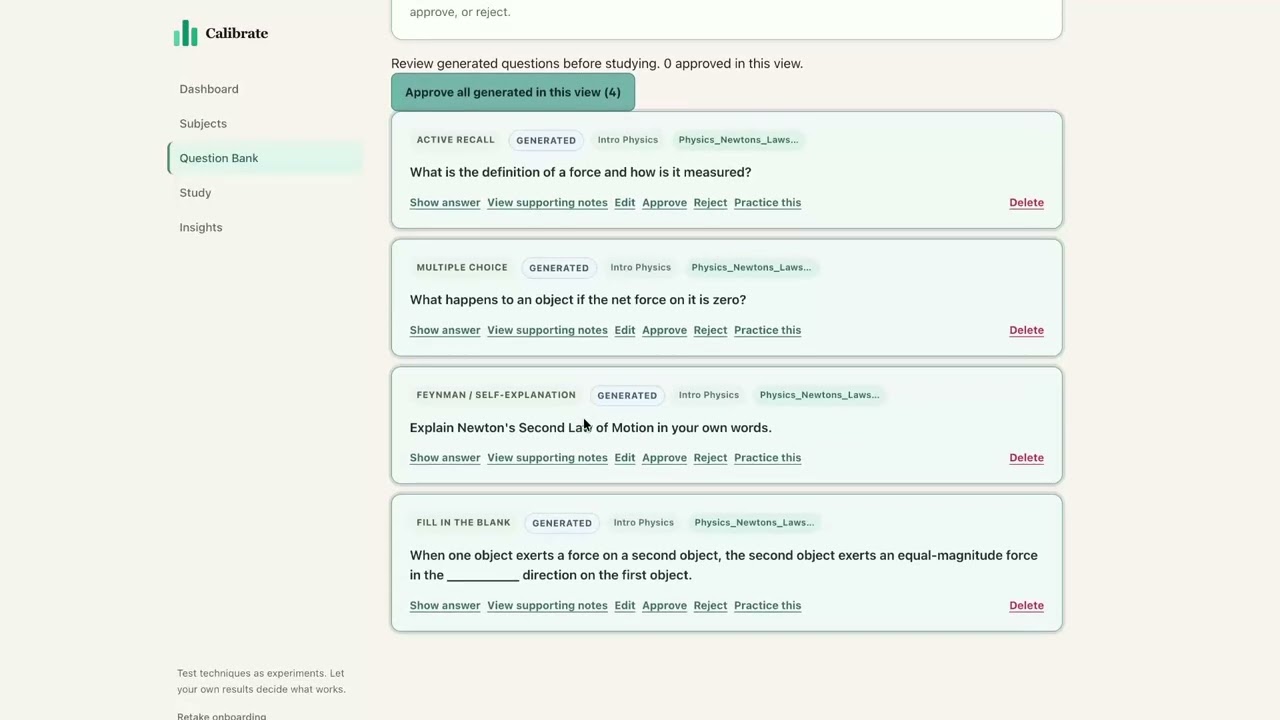
My first instinct was cards, they felt minimal and low-effort for reviewing generated questions. But once we ran it locally with the team, the cards read as more lo-fi than clean, and scanning four separate boxes meant moving left to right, then down again, a harder visual pattern than reading straight down a page. We moved to a list instead, so a student can review questions one at a time in a single downward pass. The screenshot here is the cards version we moved away from; the shipped table screenshot is still pending.
Why color-coded Approved / Needs Edit / Generated
A RAG-generated question is only as good as a student's willingness to correct it. Exams vary wildly in difficulty depending on the professor, and only the student knows that, so letting them review and adjust before committing to a set directly protects the technique's chance of actually working on their exam. Color coding let a student scan a whole batch and spot what needs attention instantly, without rereading every question in full. This logic carried into the shipped list view as well, just displayed as rows instead of cards.

Why edit and regenerate live on the card, not a separate screen
Routing a flagged question to a separate edit screen or modal would have added a navigation step to something that should feel lightweight. Editing in place kept the review loop fast: see it, fix it, move on, rather than pulling a student out of the flow they're already in.

Why 4, 6, 8, or 10 questions, with 6 as default
This one wasn't a UX preference, it came from a RAG constraint. The model can only reliably hold onto so much context before hitting token limits, so 10 questions per set reflects roughly what the retrieval pipeline could support without the question quality degrading. 6 as the default balanced having enough questions to be useful against session length, since pushing higher by default risked turning a quick study loop into something that felt like homework.
Why Leading Technique, Avg Anxiety, Sessions Logged, and Recall Rate
Calibrate isn't only testing which technique works, it's also tracking how a student feels going into a session, since exam-day anxiety plays a real role in performance even when someone actually knows the material. We track a simple pre-session anxiety self-report alongside technique performance, so a student can eventually see the connection between how they felt and how they did. Recall rate and leading technique keep the dashboard anchored to what Calibrate is actually for: showing a student what works, not managing how they feel.
Where Calibrate stands today
Here is our final prototype that one of our team members presented.
What a realistic conversion target looks like 💭
While our team is still working on fully shipping this tool around early september with users trying it over time, industry benchmarks show ed-tech apps convert free-trial users to paid at around 22–25% on average, notably higher than categories like enterprise software or fintech, largely because of how engaged users become once they see real value. We don't have our own conversion data yet since we haven't shipped, but this gives us a realistic target range to validate against once we run a pilot 🎊 .
Outcomes, and what I'd do with more time
After presenting our final prototype to mentors and incorporating their feedback, we refined several screens that felt unresolved. The next step is running this with a small group of real students; testing kicks off early September, and Calibrate's finally leaving the nest (they grow up so fast 🥹).
If we had more time, I'd run a deeper analysis, giving time to try out our competition and see if students, including me, actually learn better with Calibrate. I'd also dig into more research on what we could do differently. And with more resources, I'd speak to an expert in ed-tech and reflect their advice back into the tool.
So...what did I learn? 🤔
I wanted to lead something real! Not just contribute design work, but actually own the direction of a product from an idea to something a team could build. Calibrate ended up testing that in ways I didn't fully expect. The technical side was the easier part to plan for. The harder part was the discipline of saying no; to test-anxiety coaching, to flashy features that would've eaten our timeline, to numbers that sounded good but weren't actually backed by anything. I learned that a big part of leading design isn't generating more ideas, it's protecting the team from scope we don't have time to do responsibly. The anxiety-coaching decision is the one I'm most proud of, not because the idea was bad, but because recognizing it needed more care than a 3-week sprint could give it was the more mature call. I also learned how much iteration actually looks like backtracking, not forward progress. My first flow had no way for a user to say "this technique didn't work". I only caught that by walking through it critically and saying "wait but what about this..." 100 times 🙃. That taught me to distrust my own first draft more, and build in deliberate points to stress-test my own logic before handing it to the team. Working with a developer and an ML specialist also reshaped how I think about design decisions. Things like RAG versus in-context generation, or token limits, aren't just backend details, they're constraints that should actively shape the UI, not get bolted on after. The strongest screens I designed were the ones built with those constraints in mind from the start, not retrofitted around them. If I'm being honest though, the thing I'm most nervous and excited about is September. Everything up to now has been informed guessing, backed by research and a 20-person survey, but real. Real students, real coursework, real exams will be the first genuine test of whether any of this actually holds up. I guess we'll find out!
For next time… version 2
Almost every participant in our user survey asked for STEM support over History, Math, Chemistry, even flight school test prep came up. We're treating that as a strong signal for where the subject roadmap goes next, rather than something we guessed at ourselves.
The Centers for Disease Control and Prevention reports that roughly 11.4% of U.S. children and adolescents have received an ADHD diagnosis at some point. In our version 2 prototype, we want to tailor some of our study techniques to those with ADHD and other neurological differences. Education provides accommodations for students with ADHD that may affect their ability to take exams, but it lacks the resources to help them actually learn better with what they're going through. With expert advice, I hope to revise the tool with a new onboarding path and the ability to better support ADHD patients and students who have difficulty taking exams.