
The empty feed is BeReal's biggest growth bottleneck
BeReal's core strength - authentic, friend-based content - is also its biggest growth bottleneck. When friends are inactive, users open the app to an empty feed and bounce almost immediately. There's no algorithmic backstop, no fallback content, and no reason to stay.
My solution: BeReal Explore, a curated, finite discovery feed that lets users see authentic moments outside their immediate circle - without falling into the "endless scroll" trap that BeReal was built to resist.
Together, the numbers validate a specific thesis: users want discovery, but only with strict guardrails around it.
Reframing the problem: from the pressure to post, to the reason to stay
I started by mapping the full BeReal user journey, and my initial Problem Statement & Opportunity Note focused on the Daily Posting Experience: the anxiety users feel when BeReal's daily notification arrives at an inconvenient time, and the pressure to post something before the moment passes. That felt like the obvious friction point - it's the most visible, most talked-about part of using BeReal.
But when I looked closer at the Connect phase of the journey, a bigger threat surfaced: if friends don't post, users have no reason to stay, no matter how comfortable posting itself has become. That's a direct hit to Daily and Monthly Active Users, not just an occasional annoyance. I pivoted my focus from content creation friction to content consumption friction - from the moment of posting, to the much larger problem of what happens when there's nothing to see at all.
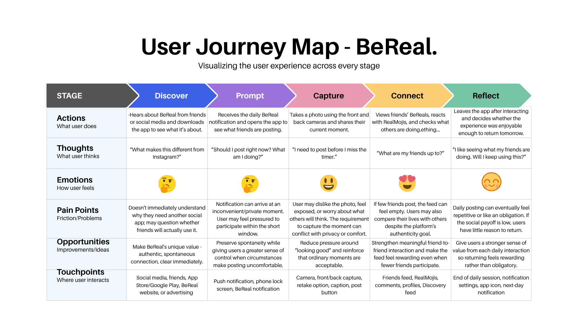
The pressure to post is a UX annoyance. An empty feed is a reason to delete the app. I chose to solve the bigger problem.
The Bounce Cycle
Without an algorithmic fallback, a quiet friend group turns every session into the same three steps:
Open App
Empty Feed
Quick Exit
↺ repeats every session until a friend finally posts
To understand how competitors solve this, I benchmarked BeReal against TikTok's public app-store review sentiment across six shared themes. TikTok dominates discovery - its For You Page gives users somewhere to go even when their social graph is quiet - and continuous consumption. BeReal dominates close-friend connection and authenticity, the exact quality TikTok users say they wish their FYP had more of.
TikTok wins on growth through broad discovery - but BeReal users actively dislike algorithmic endless scrolling. That's the gap: the PM opportunity wasn't to copy TikTok's discovery model, it was to bridge it - create discovery, but put boundaries on it.
The hypothesis: give users more to discover without giving them another reason to scroll endlessly
I started with lo-fi whiteboard sketches to test the simplest version of the idea: a second tab, sitting right next to Friends, that surfaces authentic content from outside a user's immediate circle. From there I moved into high-fidelity screens in Canva to pressure-test the interaction details - what shows up, what's hidden, and how the feed tells you it's finished.

The Guardrails - no follower counts
I intentionally omitted follower counts anywhere in Explore. The moment a discovery feed starts showing who has the most followers, it stops being about authentic moments and starts being about performance - the exact dynamic BeReal was built to reject. Keeping Explore identity-flat, no counts, no leaderboard, was a deliberate boundary to protect BeReal's low-pressure positioning even while expanding what users can see.
The UX Microcopy - designing the end of the feed on purpose
The riskiest part of Explore wasn't the content, it was the ending. An infinite feed is the easy default; a feed that stops is a product statement. I wrote the "Repeat User" and "Complete" states to make that stop explicit rather than quietly cutting users off.
"You're all caught up. Come back later for more."
Explore feed - end-of-session microcopyThat line does double duty: it tells the user the feed is finite on purpose, and it reinforces that Explore is a bounded companion to the Friends feed, not a competitor to it. This is the difference between designing for user well-being and product positioning versus designing purely for engagement - I chose the former, deliberately, even though it caps time-in-app.
What user testing told us
I ran focus groups and usability tests on the Explore concept to check whether the finite, guardrailed framing actually landed, or whether it just read as a missing feature. It held up on both counts.
"I actually like that it ends. I don't want BeReal to be another endless scrolling app."
User testing participantThat quote is the ultimate validation of the product thesis: the finite framing isn't a compromise users tolerate, it's the reason they trust the feature in the first place. Users want more to see - but only if BeReal doesn't become the app it was built to be an alternative to.
Why this matters to the business, not just the user
Voodoo acquired BeReal with a stated goal of reaching profitability through advertising, reporting €30M in 2025 revenue. Any feature pitch that stays purely in UX territory misses half the case - Explore has to serve that growth mandate too, not just make the app feel nicer to use.
The Explore feed directly serves Voodoo's growth priorities: it expands the audience users can see - Friends of Friends, or curated global content - and, crucially, it creates new real estate for native in-feed ads without disrupting the intimacy of the core close-friends feed.
That separation is the point. Ads and monetization pressure stay contained to a space users already understand as "more," while the Friends feed - the trust-critical, ad-free heart of the product - stays untouched. Explore doesn't just fix the bounce cycle; it gives Voodoo a growth lever that doesn't cost BeReal the authenticity that makes it worth acquiring in the first place.
Defining the right metrics for a finite feed
To evaluate if Explore successfully bridges the gap between engagement and authenticity without cannibalizing the core experience, I defined a strict set of Primary, Secondary, and Guardrail metrics for a beta rollout.
Primary Metric (The North Star)
Empty-Feed Bounce Rate: The percentage of users who open the app to no new friend updates, but choose to tap "Explore" rather than immediately closing the app. A decrease in this metric proves we are successfully capturing users who would have otherwise bounced.
Secondary Metrics (Engagement & Business)
- Explore Interaction Rate: Average number of RealMojis and comments sent per Explore session. This ensures active connection, not just passive scrolling.
- Ad Impressions per DAU: The increase in native ad views generated by the extra time spent in the Explore feed, directly supporting Voodoo's revenue and monetization goals.
Guardrail Metrics (The Safety Checks)
- Average Session Length (Capped): We want a small, healthy bump (e.g., 2 to 4 minutes), but if this spikes indefinitely, we’ve failed our "finite feed" promise and created an endless scroll trap.
- Core Feed Cannibalization: The volume of interactions left on actual friends' posts. This must remain stable to ensure Explore doesn't distract users from BeReal's friend-first DNA.
Final thoughts and next steps
I completed this externship culminating in a final pitch of BeReal Explore, which was awarded the Top 10% Performer distinction.
Designing this feature taught me how to navigate the delicate tension between user experience and business viability. It’s easy to say "don't build an infinite scroll because users hate it," but it takes rigorous product strategy to figure out how to drive MAU growth and ad inventory without relying on those dark patterns. I walked away with a sharpened product sense and a deep appreciation for the power of intentional friction.
If I were handing this off to an engineering team tomorrow, my immediate next steps would be defining the technical constraints of the Explore curation algorithm (e.g., how do we filter for high-quality global moments?) and configuring the A/B test parameters for our initial Beta rollout.
View the Original Pitch Deck
If you'd like to click through the full presentation, including the complete user research breakdown and high-fidelity prototypes, you can view the deck below.